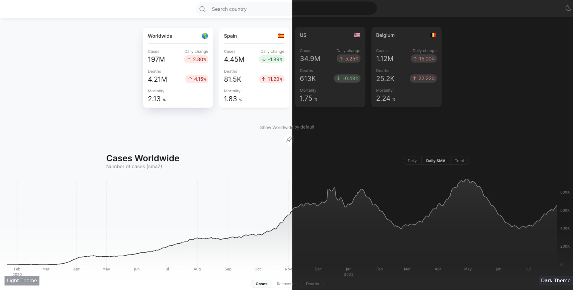
Over the last couple of days I built a covid-19 dashboard using open sourced data from John Hopkins University [1]. I put together a static site which when loaded, executes some Javascript to fetch the data from GitHub. This data is then, visualized using mostly uPlot [2] and “hand-written” sparklines, in a user interface built with Svelte [3].

This post is not a how-to article. Rather, I’ll just mention a couple of things I thought about while putting this dashboard together.
Static sites are often good enough
If I can get away with developing a project with client-only software, I’ll do it, especially if I have no expectation of making money from it. Why? Cost minimization. Hosting static sites is free. More importantly, static sites run in the browser, and browsers tend to be very backward compatible, hence the expectation is that I can “forget” about it, and it will still stay functional for a long time.
The browser is a convenient localhost. It is a neatly pre-configured server with great capabilities to visualize content, and APIs to manipulate it. However, static sites are not really static, you’re using someone’s servers to host the ‘statics’, and the visitor’s machines to do the computation. Static sites would be more useful to a much wider class of problems if it wasn’t for one thing: Cross Origin Resource Sharing (CORS) [4]. CORS makes it more cumbersome to fetch data from the client. There are ways around it. For example, serving data via a GitHub repository, or GitHub Pages, plays nice with CORS. If you use the free Gitlab CI or GitHub Actions, you could push the compute costs for a simple data pipeline to these platforms, and then consume the data from any webpage. But wouldn’t it be so much simpler, and quicker to have something like Wikipedia expose tables as CSVs, CORS free? Note that this is not a critique of CORS, which does in fact exactly what it should. It’s more of a wish to have a nice abstraction to sharing static data that gets contributed by the community.
Celebrate the effort of those who make our tools
Some of the tools we use don’t get all the love and recognition they should. Here’s what was used for the Covid-19 Dashboard.
User Interface: I built this mostly to learn Svelte after
watching a presentation from its creator [5]. I found the abstraction
close to browser natives (html, css, javascript), which I believe
is a good thing. For the icons I used the Carbon System Icons from IBM
[6] and and country-emoji [7]. For a wider collection of svg icons in
svelte have a look at Svelte-Icons [8].
Data Visualization (Updated): The charts are built using uPlot[2:1]. It’s small and performant. It took me a bit to go over the documentation, which while available, can be a bit scattered in Github. Overall, I quite like it. The bundle size went from 800 kb to about 110 kb. Still not that small, but quite an improvement. Previously, the charts were done with Vega-Lite, which is a high-level grammar of interactive graphics. I learned about Vega through Altair [9], a declarative visualization library for python. The overall bundle was about 800 kB, and most of it actually is because of the charts. I really like Vega-Lite, but I hope something can be done to reduce the bundle size. The sparklines in the table are not from Vega. I was playing with SVG generation, and it didn’t turn out too bad.
CSV Parsing: I started off writing a simple csv parser, but
I soon decided against it and went with d3-dsv [10]. To anyone who
wants to do the same, I recommend you go ahead and do it, but read
this classic blog post first.
COVID-19 Data Repository by the Center for Systems Science and Engineering (CSSE) at Johns Hopkins University - source ↩︎
uPlot - A small, fast chart for time series, lines, areas, ohlc & bars - Github. ↩︎ ↩︎
Cross Origin Resource Sharing (CORS) - Documentation, MDN web docs. ↩︎
Rethinking reactivity by Rich Harris. ↩︎
Country Emoji - Converts between country names, ISO 3166-1 codes and flag emojis. (Github) ↩︎
d3-dsv: A parser and formatter for delimiter-separated values, such as CSV and TSV. ↩︎